Crafting
Visual Value
Through Design & AI.
We blend physical premium packaging aesthetics with cutting-edge AI video production to elevate your brand presence globally.
Featured Video
Watch Our Process
About Us
Packaging That Makes Products Impossible to Ignore.
CASAVA STUDIO is a creative packaging design studio dedicated to helping brands stand out through strategic, impactful, and market-driven packaging solutions.
We combine creativity, branding expertise, and consumer insights to create packaging that not only looks attractive but also strengthens brand identity and drives purchasing decisions.
Download Company Profile"Transform products into memorable brand experiences through innovative packaging design that communicates value, quality, and authenticity."
+300
International Clients
+700
Winning Designs
99%
Satisfied Clients
Our Vision
To become a trusted packaging design partner for brands seeking innovative, commercially successful, and sustainable packaging solutions.
Our Expertise
Designing for the future.
Premium Packaging
Structural design, label aesthetics, and material selection that makes your product stand out on any shelf.
AI Video Production
Cinematic product commercials and visual stories generated using state-of-the-art AI technology.
Brand Identity
Creating cohesive visual systems, guidelines, and typography that resonates with your target audience.
Selected Works.
Scroll horizontally to explore our recent collaborations.
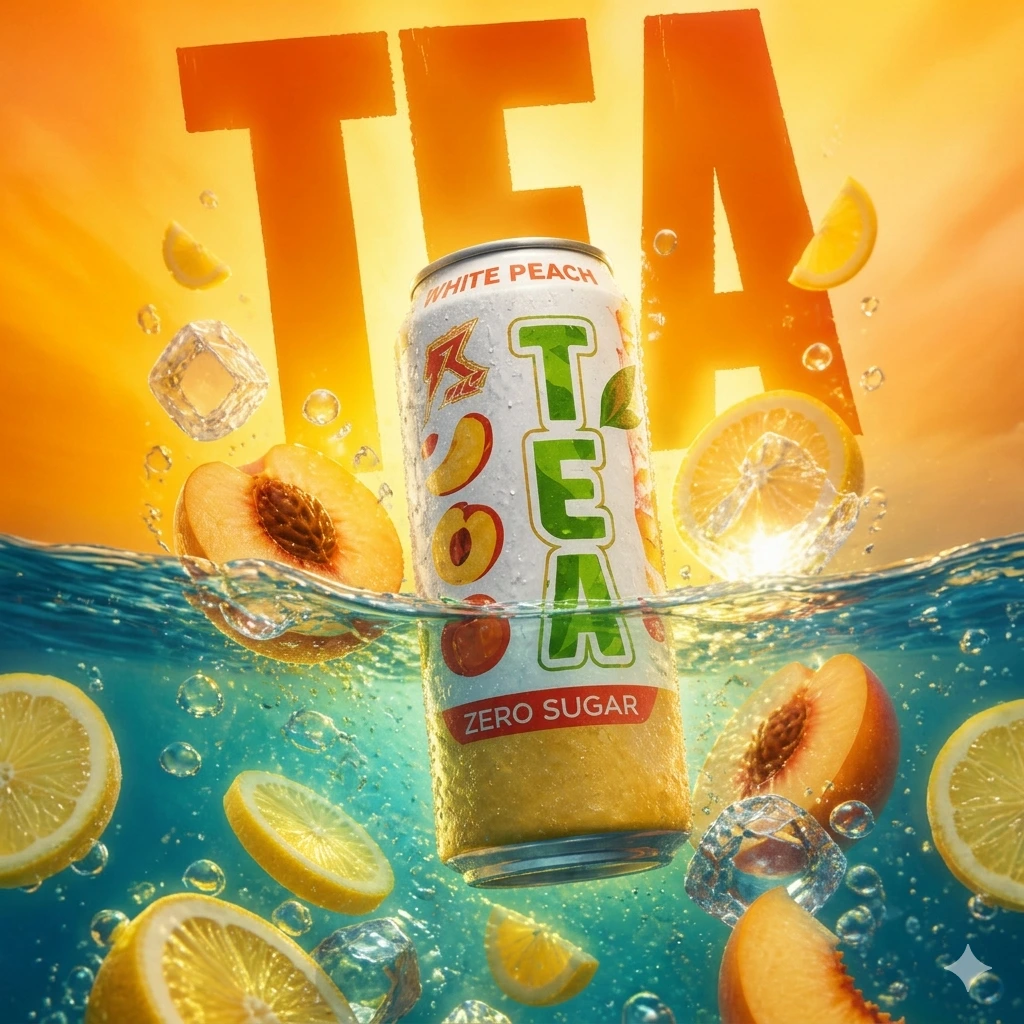
Designed to capture the sensation of ultimate refreshment, the packaging combines vibrant citrus tones, dynamic water elements, and juicy fruit imagery to showcase the product’s bold White Peach flavor profile.
The oversized “TEA” typography creates instant shelf impact, while the energetic composition of floating peaches, citrus slices, ice cubes, and sparkling water reinforces the beverage’s refreshing character.
Key Outcomes:
- ✔ Celebrates a modern, sugar-free lifestyle.
- ✔ Delivers a youthful and vibrant presence on shelf.
- ✔ Optimised for digital marketing channels.
"Refreshment in its boldest form."
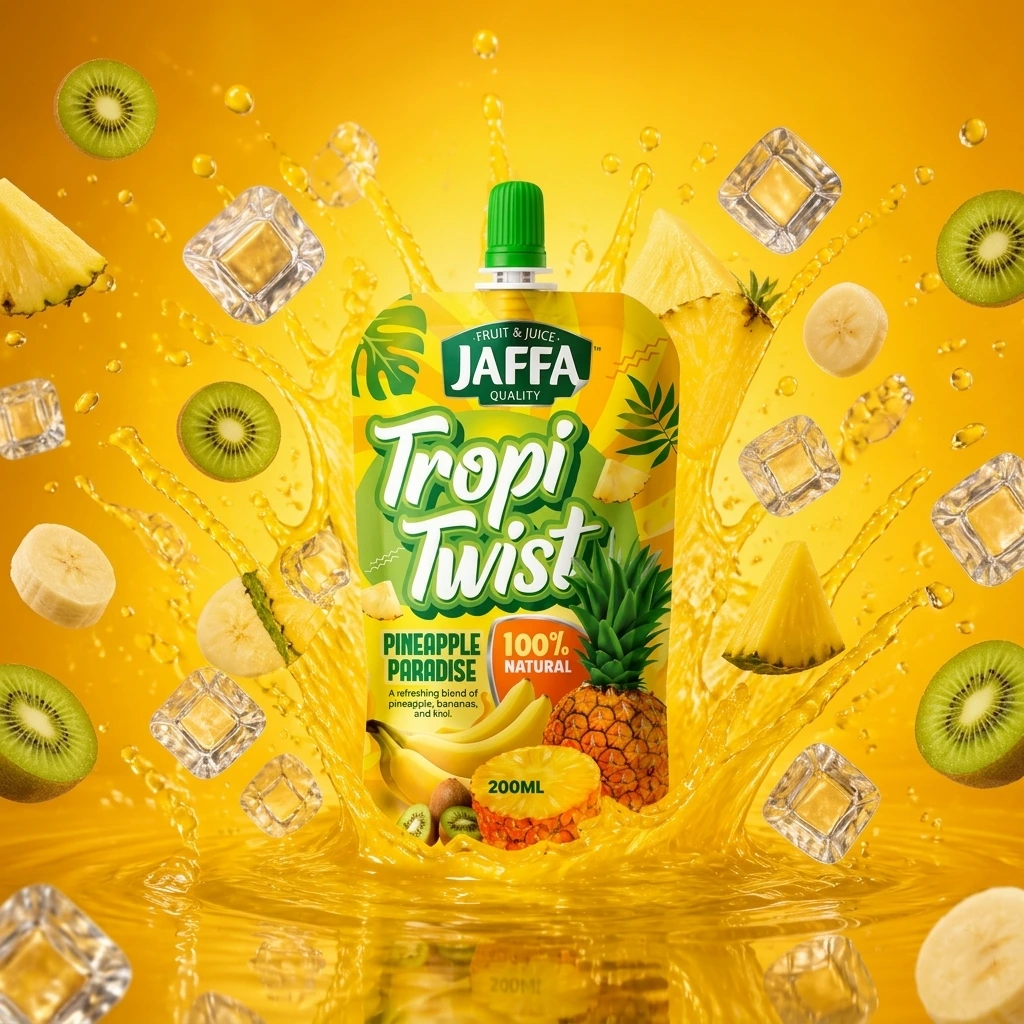
The final packaging creates a strong emotional connection by communicating:
- Tropical escape
- Natural refreshment
- Fun and enjoyment
- Vibrant flavor
- Positive energy
The design is intended to capture attention within seconds, encourage product trial, and establish a memorable visual identity that consumers can instantly recognize.
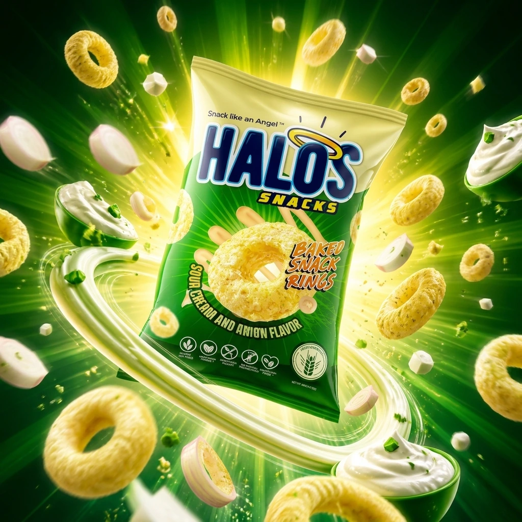
The core idea behind HALOS is simple:
Every snack deserves its moment to shine.
The design transforms each snack ring into a hero element, surrounded by radiant energy and dynamic movement. Inspired by the product name, the visual concept incorporates light bursts and circular forms that reinforce the halo symbolism while amplifying the product’s playful personality.
The result is a package that feels energetic, uplifting, and impossible to ignore.
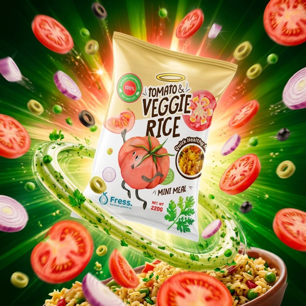
Tomato & Veggie Rice transforms a simple convenience meal into a vibrant and engaging product experience.
Through expressive character design, energetic composition, and ingredient-focused storytelling, the packaging creates strong shelf presence while reinforcing the brand’s commitment to freshness, flavor, and accessible nutrition.
"The final concept delivers a modern visual identity that feels both fun and trustworthy, helping consumers view healthy eating as something enjoyable rather than restrictive."
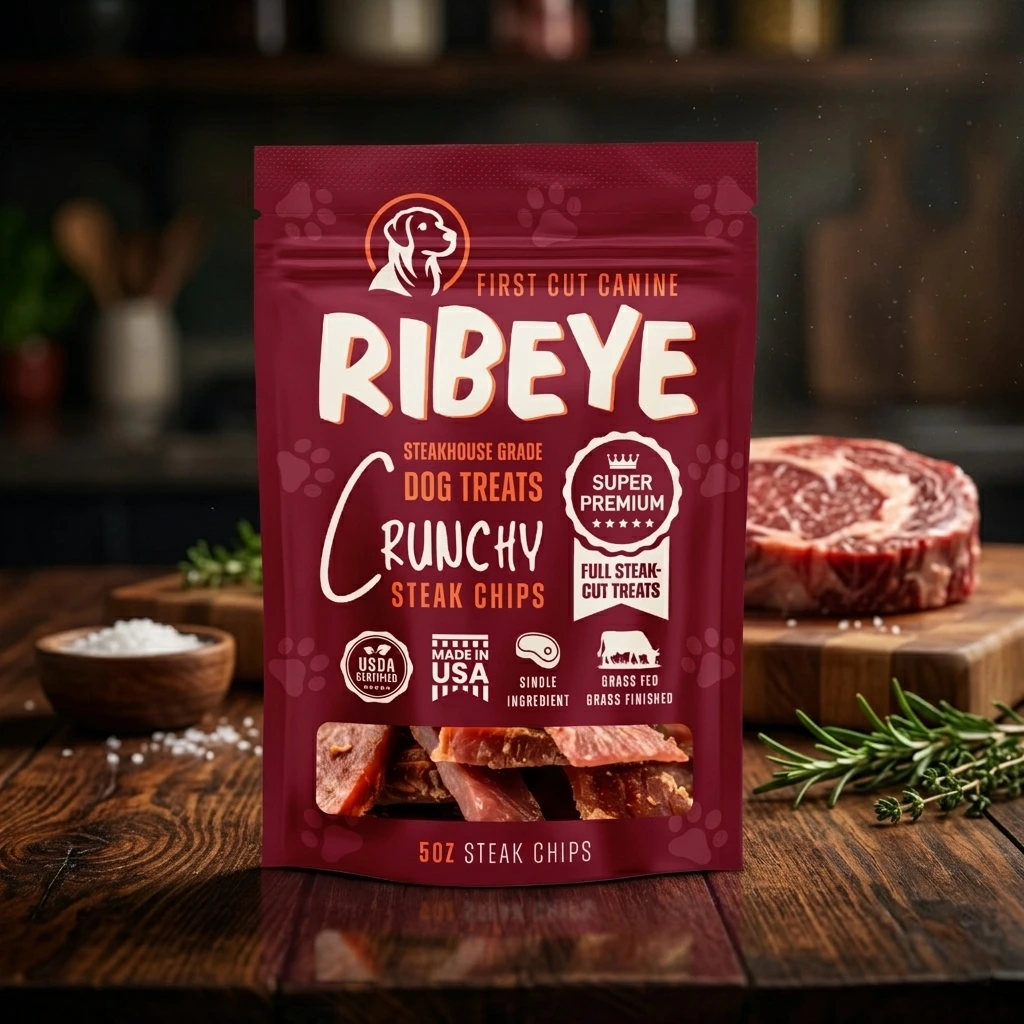
Core Idea
“Steakhouse Quality for Man’s Best Friend.”
The packaging borrows visual cues from premium meat products, artisan butcher brands, and gourmet food packaging to create a product that feels authentic, substantial, and trustworthy.
Every design element was carefully selected to reinforce the perception of quality, protein-rich nutrition, and premium sourcing.
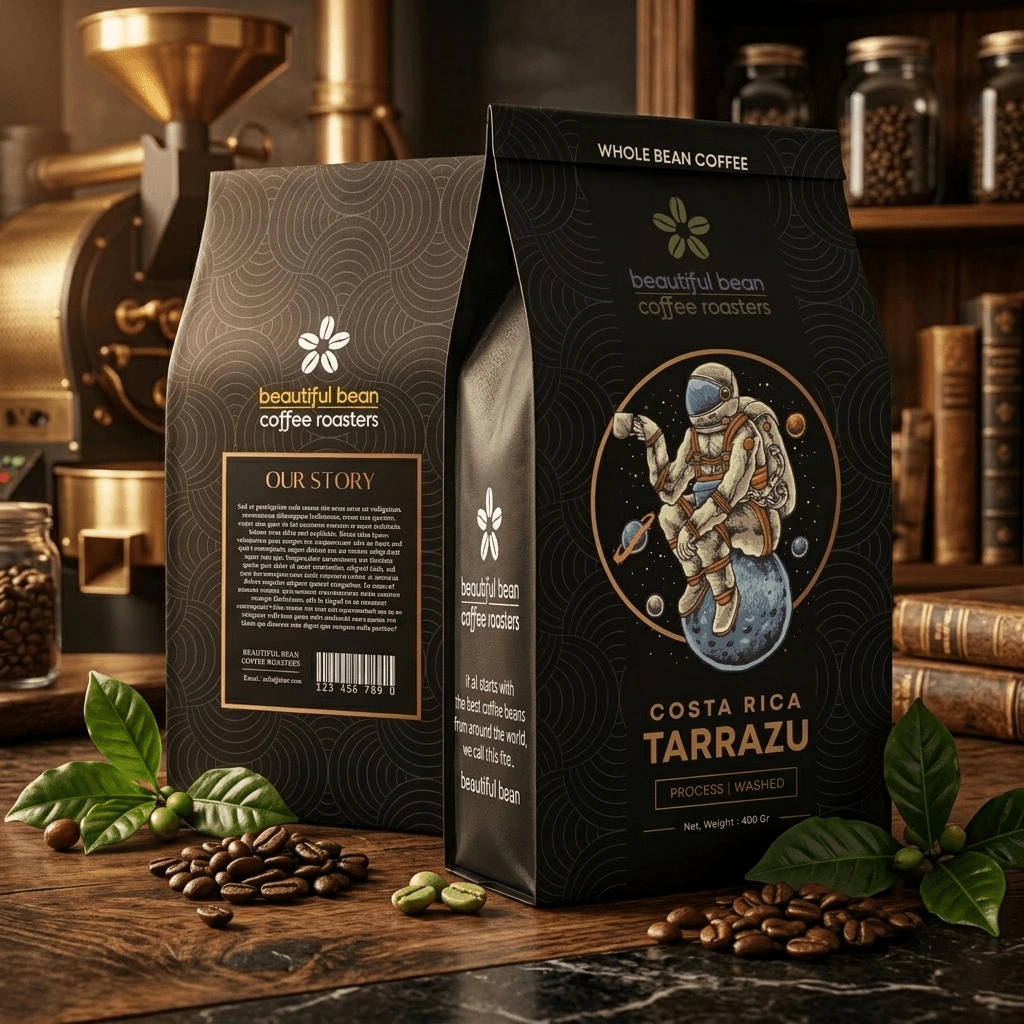
Creative Concept:
“Exploring Extraordinary Origins”
The astronaut illustration symbolizes the adventurous spirit of specialty coffee drinkers.
Just as astronauts explore unknown worlds, coffee lovers explore unique flavor profiles, regions, and roasting experiences.
The concept transforms a simple coffee package into a visual narrative about exploration, curiosity, and discovery.
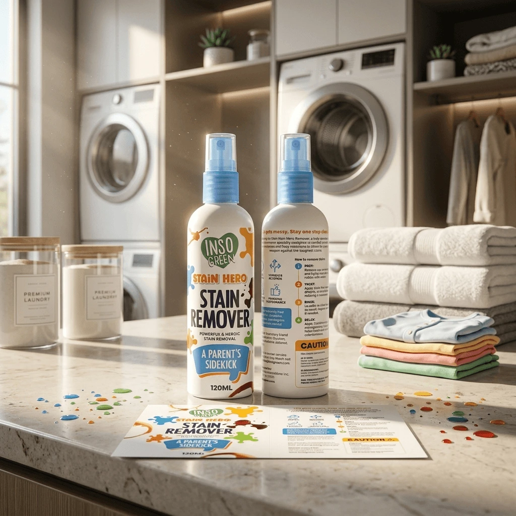
Fighting Stains With Confidence
The visual language is inspired by colorful stain splashes and playful movement. Instead of hiding stains, the design embraces them as part of life’s adventures.
The splash graphics symbolize:
This creates a memorable visual system that is both informative and engaging.
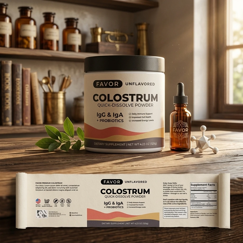
The Daily Wellness Ritual
Rather than focusing solely on biological benefits, the design emphasizes the role of the product in everyday life.
The packaging is designed to feel less like a supplement container and more like an object consumers are proud to keep visible in their home.
Inspired by modern apothecaries and premium wellness brands, the visual identity creates a sense of calm confidence.
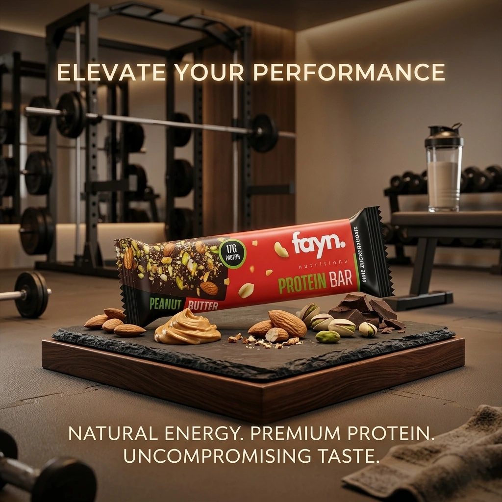
Premium Fuel
The design concept centers on the idea that nutrition is the fuel behind achievement. Just as premium vehicles require premium fuel, high performers require high-quality nutrition.
The packaging combines:
- ▪ Athletic ambition
- ▪ Premium ingredients
- ▪ Clean nutrition
- ▪ Elevated aesthetics
The result is a product that feels aspirational without becoming intimidating.
Mango Tango
"Mango Tango" uses a playful, script-style, handwritten font in red with a thick white outline.
This makes the text pop against the warm background and gives it an energetic, fun, and accessible feel. We work using Adobe Illustrator, Photoshop, and generates Ai for Video.
Costa Rica Tarrazu
The design concept successfully blends luxury and whimsy. It tells the consumer that the brand takes its coffee seriously (clear origin, process data, sleek black packaging), but doesn't take itself too seriously (the coffee-drinking astronaut). This makes it highly giftable and shelf-ready for a competitive specialty coffee market.
Design use: Adobe Illustrator, Adobe dimension, and Generates AI Video.
SilaCalm
The packaging design for SilaCalm™ Advanced Repair Cream utilizes a highly effective "cosmeceutical" aesthetic that seamlessly bridges clinical authority with premium retail appeal. By pairing a clean, medicinal white base with trusted deep teal accents and a striking metallic blue cap, the jar instantly projects safety, purity, and professional-grade skin relief.
The layout employs a brilliant problem-solution hierarchy, using a dynamic, angular color block to anchor the brand identity on the left while leading the eyes effortlessly to the bold "ADVANCED REPAIR" solution on the right. Finally, the inclusion of a dedicated gray anchor band at the base—complete with intuitive symptom icons for dry, flaky, and irritated skin—ensures outstanding shelf scannability, allowing target consumers to instantly recognize the product's high-performance functional benefits.
Let's build something
extraordinary.
Whether you need a full brand overhaul or a single premium packaging design, our team is ready to bring your vision to life.
sales@casavastudio.com
Timezone
GMT+7 (Available for global calls)